
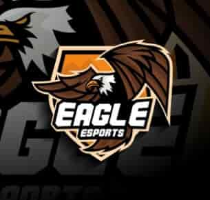
Eagle Esports - Mascot & Esport
Our company is really happy with the new website design. It looks highly professional yet really simple to navigate. We recommend Logohouse to anyone looking to avail the best seo writing/website designing services.

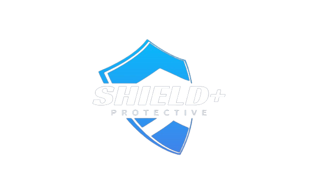
Are you ready to take your security company to new heights? A powerful and memorable logo can be the key to unlocking the trust and confidence of your target audience. At Logo House, we specialize in creating exceptional security logos that not only capture the essence of your brand but also establish a strong foundation for your business success.
With years of experience in the industry, Logo House has become a trusted name in security logo design. We understand the unique challenges and requirements of the security sector, and our team of talented designers excels at creating logos that convey professionalism, reliability, and a sense of security.
At Logo House, we believe that every security company is unique, and your logo should reflect that individuality. Our design process begins with a deep understanding of your brand values, target audience, and industry positioning. We then translate these insights into a custom logo that embodies the essence of your security business and resonates with your target market.
We take great pride in our ability to blend creativity with precision. Our designers pay meticulous attention to detail, ensuring that every element of your security logo is perfectly aligned with your brand identity. From the choice of colors and typography to the placement of symbols and icons, we craft logos that leave a lasting impression.
We understand that time is of the essence when it comes to establishing your security brand. That's why we strive to deliver our logo design services with efficiency and promptness. Our streamlined process ensures a quick turnaround time without compromising on the quality of our work, allowing you to hit the ground running and start building brand recognition.
During the discovery phase, we dive deep into your security company's unique attributes, values, and target market. By understanding what sets you apart from the competition, we lay the foundation for a logo design that captures your brand essence.
Based on the insights gathered during the discovery phase, our team of designers begins the creative process. We brainstorm ideas, sketch out concepts, and explore different design directions to develop a range of logo options for your consideration.
Once we have a selection of initial logo concepts, we collaborate closely with you to gather feedback and refine the designs. We take your input seriously and work iteratively to make adjustments and modifications until we achieve a logo that exceeds your expectations.
After the refinement stage, we finalize the chosen logo design. Our team polishes the details, ensuring that the logo is pixel-perfect and ready to represent your security brand across various platforms and mediums.


Seeking out to the professional designers in the digital industry for creating best branding designs that speak for themselves.
Your security company deserves a logo that conveys trust, reliability, and professionalism. With Logo House by your side, you can unlock the power of a custom-designed security logo that sets you apart from the competition and resonates with your target audience.
Get in touch with us today to discuss your security logo design needs. Let's create a logo that strengthens your brand and builds trust in the minds of your customers. Contact us now to schedule a consultation and take the first step towards a strong security brand.
Created By State Of The Art Designers. Logo House’s Inventory Includes Sensational Projects.
Our logo designing process comprises the following 4 easy steps that will help you develop
an effective brand identity.

In this particular phase, the team will ask the client for the details of the required logo design that will resonate with their brand.
eXPLORE
In this particular phase a sample design is created after an extensive brainstorming phase on the requirements gained by the client.
eXPLORE
After passing through the first two steps of the creative process, the design is reviewed one last time for final touch-up.
eXPLORE
After passing through the 3rd phase, the designed logo is delivered to the client along with all the required files.
eXPLORE

Our company is really happy with the new website design. It looks highly professional yet really simple to navigate. We recommend Logohouse to anyone looking to avail the best seo writing/website designing services.
Attentive to details and with well mannered work ethics. Logohouse did an amazing job creating my corporate logo design. I’ve thoroughly enjoyed the creative process of design making which they offered. I enjoyed working!
With Logohouse help, we were able to develop some really appealing stationary designs for business. They are highly hard-working individuals. We recommend anyone looking for branding services to contact them. Really loved the creativity.
Logohouse is the best creative agency. I've come across over my experience in digital design. They are efficient communicators, above all professional designers who understand the modern needs for website designing.