
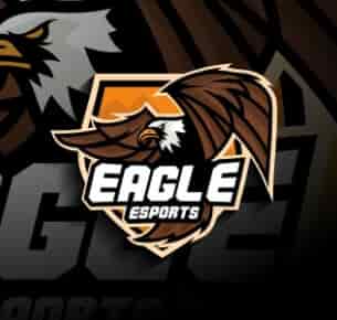
Eagle Esports - Mascot & Esport
Our company is really happy with the new website design. It looks highly professional yet really simple to navigate. We recommend Logohouse to anyone looking to avail the best seo writing/website designing services.
Are you in search of a memorable and impactful logo that can represent your brand's identity? Look no further! Logo House is your one-stop destination for top-notch flat logo design services that will set your business apart from the competition. We understand the significance of a well-crafted logo, and our team of talented designers is committed to creating visually striking and meaningful logos tailored to your unique requirements.
Flat logo design is more than just a trend; it is a timeless style that has proven its effectiveness across industries. Unlike complex and intricate logos, flat designs adopt a minimalist approach, focusing on simplicity and clarity. This style eliminates unnecessary elements, leaving only the essentials that make your brand instantly recognizable.
In the fast-paced world we live in, where consumers are bombarded with information, a flat logo is a breath of fresh air. It delivers a clear and straightforward message that leaves a lasting impression on your target audience. At Logo House, we understand the power of minimalism, and our designers expertly craft flat logos that leave a lasting impact, helping your brand stand out amidst the clutter.
We believe that each brand is unique, and your logo should reflect that individuality. Our designers invest time in understanding your brand's ethos, values, and target audience to create custom flat logos that align perfectly with your business.
A great logo is one that works across various mediums and platforms. Logo House creates flat logos that maintain their integrity whether they are printed on a billboard, displayed on a website, or featured on social media profiles. Your logo will shine in all its glory, regardless of the size or format.
Trends come and go, but the elegance of a flat logo design endures. By opting for this classic style, you ensure that your logo remains relevant and impactful for years to come.
At Logo House, we believe that premium logo design should be accessible to businesses of all sizes. Our transparent pricing and budget-friendly packages make sure you get exceptional value for your investment.
At Logo House, we take a collaborative approach to logo design. We start by gathering insights into your brand, industry, and competitors. Our designers then brainstorm ideas, sketch concepts, and meticulously refine them until we have the perfect foundation for your logo.
Once we have crafted a selection of initial designs, we share them with you for feedback and input. Your satisfaction is paramount, and we work closely with you to make any necessary adjustments to ensure the final design aligns with your vision.
At Logo House, we believe that a powerful logo is the cornerstone of every successful brand. Our flat logo design services are designed to elevate your business by providing you with a visual identity that leaves a lasting impression. With our team of talented designers and a customer-centric approach, we are committed to bringing your vision to life.
Join countless satisfied clients who have already trusted us to create their brand's identity. Let Logo House be the creative force behind your success. Get in touch today and take the first step towards a stunning flat logo that will stand the test of time.
Seeking out to the professional designers in the digital industry for creating best branding designs that speak for themselves.
Created By State Of The Art Designers. Logo House’s Inventory Includes Sensational Projects.
Our logo designing process comprises the following 4 easy steps that will help you develop
an effective brand identity.

In this particular phase, the team will ask the client for the details of the required logo design that will resonate with their brand.
eXPLORE
In this particular phase a sample design is created after an extensive brainstorming phase on the requirements gained by the client.
eXPLORE
After passing through the first two steps of the creative process, the design is reviewed one last time for final touch-up.
eXPLORE
After passing through the 3rd phase, the designed logo is delivered to the client along with all the required files.
eXPLORE
Our company is really happy with the new website design. It looks highly professional yet really simple to navigate. We recommend Logohouse to anyone looking to avail the best seo writing/website designing services.
Attentive to details and with well mannered work ethics. Logohouse did an amazing job creating my corporate logo design. I’ve thoroughly enjoyed the creative process of design making which they offered. I enjoyed working!
With Logohouse help, we were able to develop some really appealing stationary designs for business. They are highly hard-working individuals. We recommend anyone looking for branding services to contact them. Really loved the creativity.
Logohouse is the best creative agency. I've come across over my experience in digital design. They are efficient communicators, above all professional designers who understand the modern needs for website designing.